Hotelr iOS Redesign
Research | UX | UI

How do you make people feel comfortable sharing a room with a stranger?
About
Hotelr aims to build a safe community of members who can share hotel rooms for a fraction of the price. Users can search cities for hotels and create reservations or request to join existing users
The Challenge
Hotelr approached our team with their concept and a few mockups for their iOS app. Their idea was not validated yet. It was our responsibility to conduct research, design the core functionalities of the app and improve overall usability for the first release. The founders sought an aesthetic yet functional app that conveyed trust and a sense of community. They gave us freedom to define the brand identity.
My Role
I co-led a team of 6 other product designers. I served as the point-of-contact with the client and oversaw the entire process from user research to asset hand-off. I managed meetings, ran design studios and critiques, and ensured the team met deliverables. I built the information architecture for the app.
Deliverables
- User Insights
- Information Architecture
- Core Functionalities' Designed
- Style Guide
- Design Specifications
7 designers, 8 weeks, and half of my body weight in Philz coffee later..
After (Sneak Peak)
Before


Process
User Research
We brainstormed potential users, situations, their motivations, and desired outcomes. We developed a provisional persona. This helped us envision potential scenarios users may find themselves in and what would prompt them to use the app.
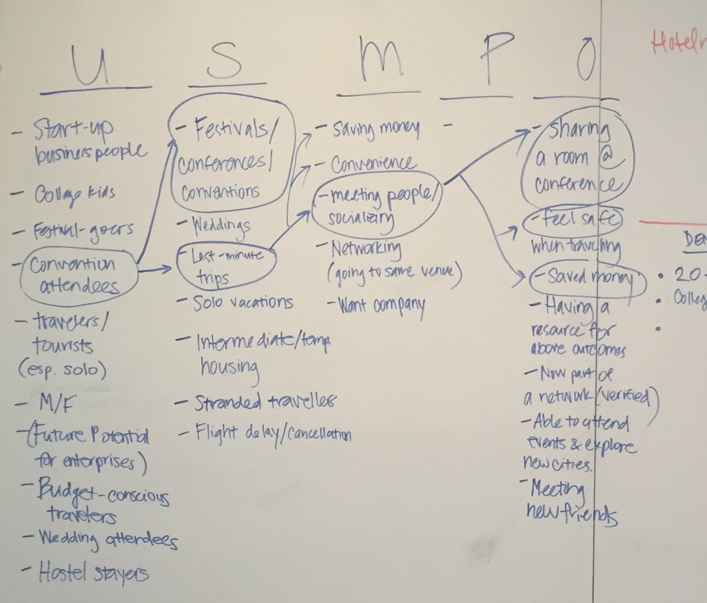
Several questions arose among the team which served as a guide to what we asked in the next steps.
- What do people need to know about potential roommates?
- What makes people feel safe?
- Will a good deal convince users to share a room?
Comparative & Competitive Analysis
What are others currently doing, and how can Hotelr stand out?
We assessed competitors in terms of features, user experiences and overall designs. We wanted to understand how different companies were addressing similar task flows and to identify a solution offering a competitive advantage.
We identified 5 user flows; we looked at apps that had 'roommate matching' to learn how other companies were designing for trust. We also looked at hotel booking apps to observe how they were presenting information.

Surveys
Since sharing a hotel-room was an unfamiliar concept, the team decided to conduct a survey to gauge user interest in the service. We wanted to understand if people were open to sharing a hotel room and how they learned to trust others. We observed variances in gender and age.
Q: Would you choose to share a hotel room and split the cost with someone you don’t know?

User Interviews
We interviewed users to gain an in-depth understanding of people’s travel habits and thoughts or experiences with sharing their space with strangers. We wanted to know their biggest concerns and initial questions about potential matches. We would use this information to suggest redesigns.
Based on our provisional persona, we targeted young working professionals who traveled at least once a year.
We interviewed people who stayed at hostels, as there was an established level of comfort in terms of staying with strangers. We assumed those in the 22-34 age range were interested in saving money, more likely to give up privacy, and relatively tech-savvy.

What would you need to know about a roommate you’re living with between a day to a week?
Across the board, it was their job and their Facebook profile so that they can see a picture of the person, as well as how many friends they have to get a sense of the type of person.

Usability Tests
We asked 5 participants to complete a couple of tasks using Hotelr’s current prototype. We wanted to determine the following:
- Can users distinguish between creating a reservation vs. joining a reservation?
- Is the content in user profiles relevant?
- General problems users encountered
After reviewing our notes and footage, we grouped common pain points.

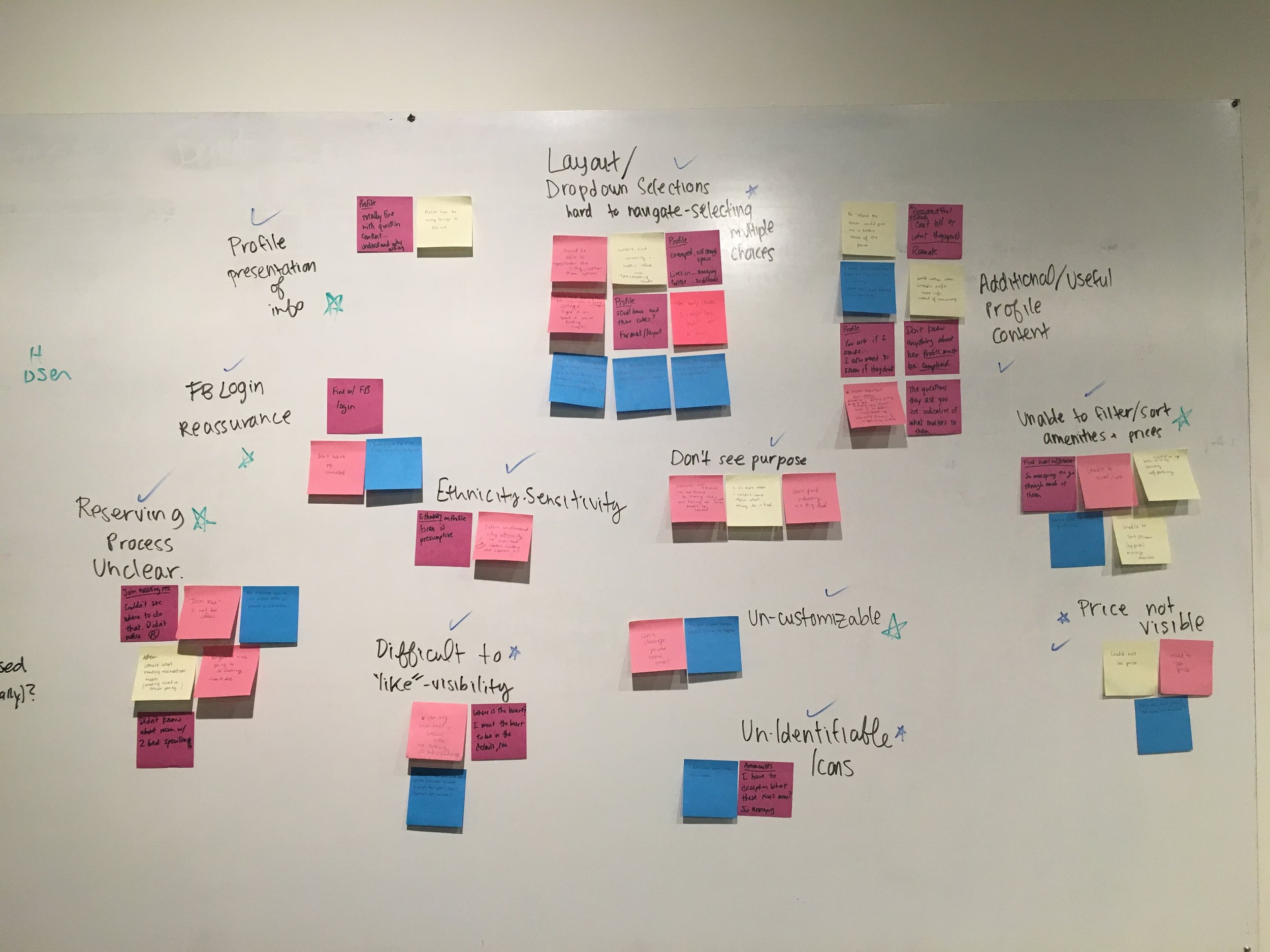
We prioritized these based on what was important to the user vs. what was important to the business. Any impediments to joining a reservation were prioritized, highest.
Takeaways

Research yielded insight on the contexts within which this app could be used in, in comparison to cheaper hotels and Airbnbs. Although it was challenging to test a new app with a unique concept, we were able to start visualizing how Hotelr would fit in with other booking apps. We understood the influential factors or constraints: privacy vs. social interaction and quality vs. budget. The option of socializing was dependent on the type of user, but we believed the platform should allow for this interaction to occur.
Users expressed trust and security as some of their biggest concerns. We knew our designs had to provide users with enough information to feel comfortable along with improving the comprehension and usability.
Crafting the Experience
Task Flows
We drew out task flows for the core functions of the app to determine what steps a user would likely take and how to best present the information.

New questions arose as we hammered out logistics.
- When in the overall flow should users create their profiles?
- How much information can users without profiles see?
- Can users cancel or modify reservations?
- When should users be able to chat one another?
For the sign-up flow, we wanted to give users as much value up-front before requiring them to sign-up and create a profile:
Information Architecture
I mapped out the information architecture to determine user decision points and relationships of tasks. This would be used to create prototypes.

Select images to expand

Design Studio


We performed 6 rounds of ‘Crazy 6’s to generate design ideas.
- 6 x 1 minute sketching sprints per round
- Presentations and discussions
- Final screens sketched based on feedback
- 20 minimum interfaces for each screen generated
Lofi Development
We quickly turned the sketches from the design studio into a Lofi prototype for the 10 flows.

We conducted usability testing with 5 participants and reiterated our designs.

UI Decisions
Style Definition
We kicked off the UI phase by having each team member create a style tile to showcase desired colors, typography, icon styles and brand descriptors with a sample screen to drive discussion. We combined elements from each tile and proposed a few versions to the Hotelr team to ensure our ideas were aligned with their overall vision before creating one style guide.
We selected dark, soft colors for comfort since people tend to book hotels at night and bright orange accent to mirror Hotelr’s logo color. We wanted a sleek look to appeal to the younger target audience.


Hifi Development
We created Hifi screens with frequent design critiques and ensured we were using the same guidelines (for button sizes, header styles, etc.).

